Fashion in Review: Color Coordination Craze
Ella Werdell '23 News Editor
It’s no secret that color or a lack thereof can make any outfit stand out, but finding the perfect color palette is no easy task. There are various color schemes that work perfectly for any outfit, but there are also some that are harder to pull off than others.
Let’s start off with my personal favorite color schemes. I love analogous colors and complementary colors, I think they are flattering in every outfit style. Analogous colors are colors that are next to each other on the color wheel, making schemes with similar and complementary tones. Some of my favorites are greens and blues. Complementary colors are opposite each other on the color wheel. Some of my favorites are orange and blue (as long as they are not fluorescent) and magenta and sage/light green. These colors are much harder to style because of the drastic contrast they create, but when done well, they outshine everyone else. I would also use complementary colors sparingly when first getting used to it because they are very bold, which is never bad when paired with confidence.
Monochromatic, all of one color, outfits are another one of my favorites. When done well, they can be a super cool addition to the weekly outfit rotation. When creating a monochromatic outfit there are a few colors to avoid, specifically anything neon. Too much neon turns into the horrendous eighth grader highlighter outfit we are all too familiar with, not a good look. To make sure monochromatic outfits are not too bland or too much of one color, it is important to mix lengths. The rule of thirds is a helpful tool to keep in mind. This rule basically states that unbalanced ratios are more interesting to look at and typically more flattering. Creating an unbalanced ratio is as simple as ⅓ on the top and ⅔ on the bottom, or vice versa.
This may be an unpopular opinion, but I love pairing brown and green together, as well as utilizing various shades of each color. When styling these two colors however, there is a fine line between looking like Shaggy from Scooby Doo or a fashion icon. Avoid bright green at all costs! Bright green is extremely difficult to style because it tends to take away from the rest of the outfit. Furthermore, I used to be a hater of navy blue on black, but I have recently been convinced that the two can pair well together. For example, black jeans and a navy sweater with white accents. Typically as long as there is another neutral color present, preferably white, the two colors are distinct enough to not clash. As long as the two colors are easily distinguishable from one another, they look good together and make a statement.
Along with knowing what looks good together, it is definitely important to know what colors do not go together, to make sure no clashing occurs. Two colors that should never be worn together are orange and green. There is a reason these two colors are never included in any color schemes- it tends to make one look like they are preparing for a pumpkin festival. Another pair of clashing colors is orange and purple. These two are too loud and too ugly. Pairing yellow and red together can either look like Winnie the Pooh or a firetruck. Finally, pairing two fluorescent colors together when not attending a neon party is completely unnecessary and far too vibrant. In fact, wearing any fluorescent colors as more than just an accent is a bold choice that is seldom rewarded. Standing out is important, but not because of blinding colors.
If you are feeling overwhelmed with styling colors, my tip to you is: when in doubt, go to black. It is nearly impossible to mess up and it matches everything. Black is the best color to pair with, other than maybe white, especially if you plan on making a statement with bold color schemes and combinations. That being said, it can be difficult to make an all black outfit remain chic and elegant (if that is what you're going for of course), but one way this can be done is by pairing different textures and lengths together. For example, a long black coat with a short black sweater and black leather pants, each piece has different textures and lengths creating a contrast, while still using the same color.
Even though my opinions on colors are very solidified, there is no reason to listen to me or take my advice into consideration unless you feel like it or agree with it. Wear whatever makes you happy! If that is orange and green or multiple fluorescent colors, go for it, but make sure you wear it with confidence because no one can make fun of that.
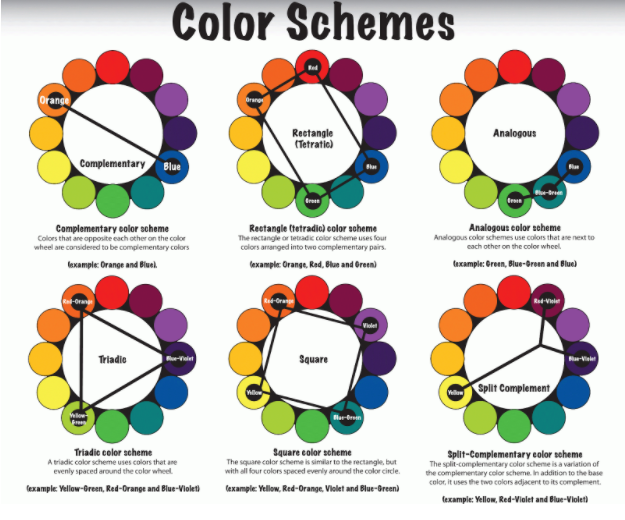
Photo from Pinterest- This is a diagram of some of the most popular color schemes, including analogous and complementary colors. It is important to know each color scheme before deciding how to use them in your fashion.
