Google Icon Ratings
Ruby Gifford ‘23 Features Editor
On October 26 of this year, Google began releasing redesigned icons for multiple applications on the Google Workspace (previously G Suite) platform. The sudden change left users confused, many of whom disapproved of the redesign. Why did the new Google icons get such a low approval rate?
There are many elements that contribute to how well-designed an icon is, but I’ve boiled them down to five categories:
Using these five categories and guides, I rated four categories of icons in the following order:
There are many elements that contribute to how well-designed an icon is, but I’ve boiled them down to five categories:
- Color/Shading: How are colors and shading used in the icon? Are they used well? Are they appropriate? Do they look good?
- Composition: Icons are usually simply shaped and balanced to make them look pleasant at such a small scale. How does the shape of the icon contribute to the icons’ design?
- Consistency: The key to a good icon is consistent and compatible elements throughout the design. Does the icon have conflicting elements?
- Expression: Different applications have different purposes so each icon will have a different message it’s trying to convey. How well does the icon convey that message?
- Ease: Is the design easy on the eyes? Is it memorable and functional?
Using these five categories and guides, I rated four categories of icons in the following order:
- Old Google Icons
- New Google Icons
- Other Program Icons
- Menu Icons
|
While this icon initially seems simple and pleasing to the eye, it all takes a turn for the worse when you realize… they’re all watching you.
Canvas= evil/10 |

|
|
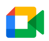
Somehow it’s worse that the old green dialogue bubble! The triangle at the front of the camera gave Google an opportunity to make the colors worse, and they certainly took it. Thanks, I hate it.
Google Meet= -10/10 |
|
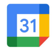
The color isn’t bad, but the shape is too basic. It’s no longer recognizable as a calendar—one of the best traits of the older version. The “31” in the middle is a feeble attempt to redeem itself.
Google Calendar= 0/10 |
|
|
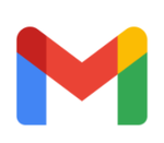
Where did that lovely envelope go? Now it just looks like the letter “M,” and the corners look inconsistent for no reason. The colors are awful, too.
Gmail=2/10 |
|
This is too simple and abstract; it’s literally just 3 shapes. I don’t think they put a lot of brain power into this one. I gave it one point for each shape.
Jamboard= 3/10 |

|

|
I understand the concept, but it still feels messy and too complicated. I feel like the smaller this icon gets, the more indistinguishable it is. The geometry makes my head hurt.
Actively Learn= 4/10 |
|
I have a lot of appreciation for this icon, but it has a very specific use. This icon can only really be used for a menu of apps. Symetrical and clear, but limited applications.
Chocolate/Waffle= 8/10 |

|
|
These menu icons are a classic! You see it everywhere and it’s pretty standard as far as menus go. It’s very cute! I love how many names this one has! Peapod, meatballs, kabab - they’re all good options.
Meatballs/Kebab/Peapod= 9/10 |
|
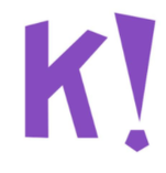
Classic Kahoot! This icon is so enthusiastic and properly conveys the relief of knowing you get to [waste class time] play a fun, educational game.
Kahoot!= 10/10 |
|
|
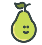
So cute! Consistent line width and design; the colors are so comforting and cheerful! The pear looks like he’s not paying attention (which isn’t necessarily inaccurate, as far as PearDeck goes).
PearDeck= 11/10 |
